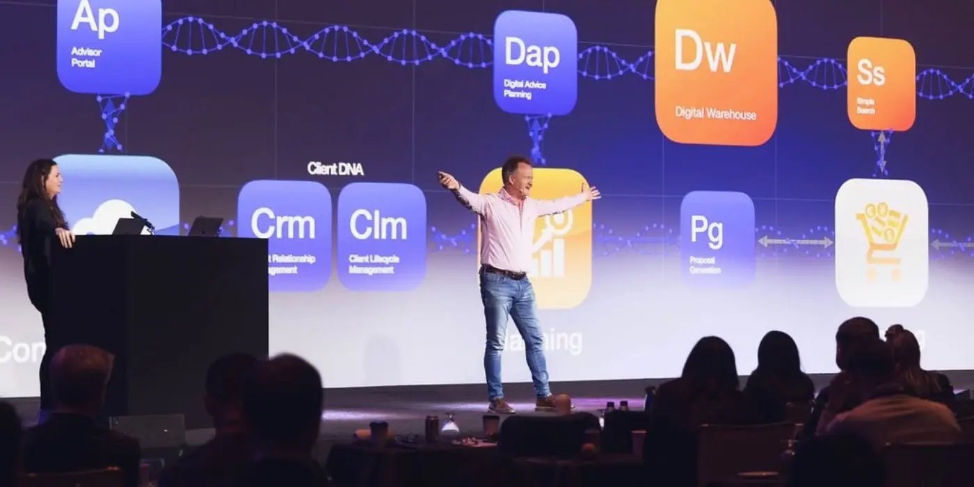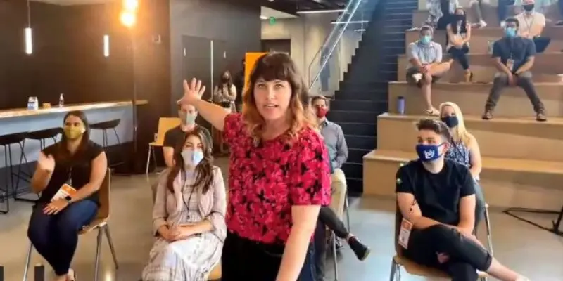
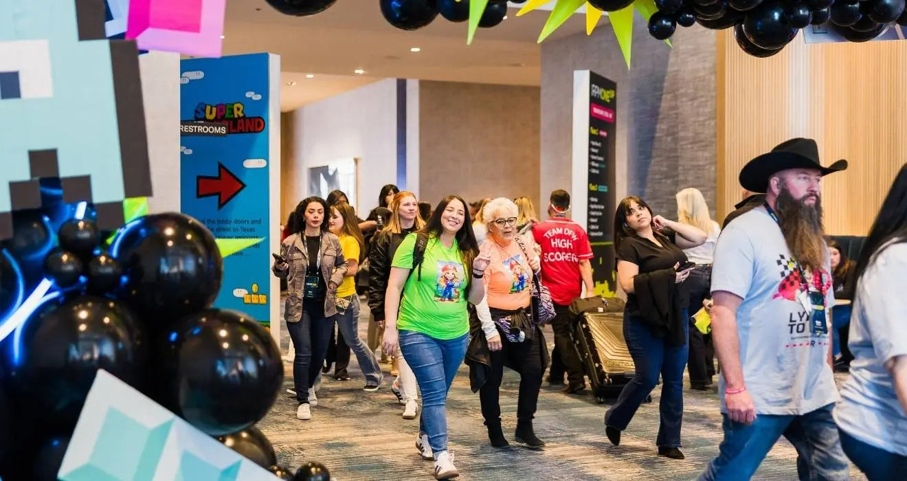
Remember the feeling of wonder as a kid, heading into a theme park or zoo, turning the corner, and continually finding something new? We all know the emotional experience of discovery and curiosity. But too often, rooms are designed to be taken in all at the same time.
The best designed event spaces don’t reveal everything at once. When attendees can take in a whole room in a single glance, they stop exploring and start waiting. But building in surprise, compression, and visual layering keeps people moving, connecting, and engaged, letting your event do more of the strategic work you designed it to do.
What is the one-gulp problem in event design?
The one-gulp problem is what happens when an attendee walks through the door, reads the entire room in a single glance, and sits down without a desire to explore or mingle.
Picture an attendee walking into your general session. They step through the front doors, and in two seconds they’ve seen the stage, the screens, and the seating. There’s not much more to see, so they sit down and pull out their phone.
Billy Bell, Event Designer at Meeting Tomorrow, says the key to avoiding this is to deliberately withhold part of the room from the entry sightline so people are prompted to move, look around, and find something they didn’t expect.
“I strongly believe that you should never enter a space and, in one gulp, be able to understand everything that is in that space,” he says. “I’m a huge advocate for exploration, and there should always be ways for people to discover something new. ”
The reasons for designing with this concept in mind extend beyond aesthetics. For example, from a marketing perspective, the room is forming a brand impression the moment an attendee walks in. A space that reveals itself fully in two seconds generates one impression, instantly. A room with layered sightlines, a visible-but-obscured secondary space, and discovery moments translates directly into longer dwell time, more peer-to-peer interactions, and more of the attendee behavior you built the strategy to produce.
How do you build compression and release into a corporate event layout?
Compression and release is a spatial sequencing technique that funnels attendees through a tighter space and into a larger reveal, and it changes how a room feels before anyone says a word from the stage.
To describe this further, Bell gives the example of the experience Disney World creates.
“Compression and release: you funnel people through a tight space into a big open reveal, like a Disney queue,” he says. “It completely changes how a room feels and allows you to control the sightlines and narrative.”
Of course, you’re unlikely to float attendees through a man made canal as animatronics explore all seven continents like on “It’s a Small World.” But in practice, you can treat the pre-function corridor, registration lane, or hallway approach as part of the design rather than disregarding it. The technique costs less than most planners assume because it uses the venue’s existing architecture: you work with the doorways, columns, and sightlines the building already has.
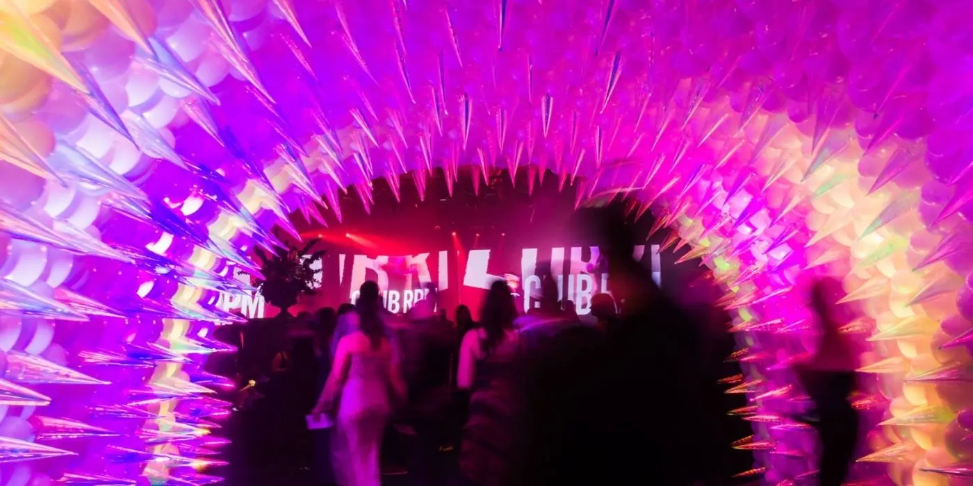
Three components make compression and release work in a corporate venue:
- A narrowed or lowered approach, often created with scenic walls, draped vignettes, or tunnel structures.
- A single reveal moment where the ceiling, light level, or horizon line opens up.
- A visual anchor on the far side of the reveal (a stage, an installation, a view) that rewards the walk.
How do you keep discovery going after attendees walk in?
Event teams can keep discovery going by spreading a few unexpected moments across the whole event space, away from the entry sightline, so attendees find them by moving through the room instead of spotting them from the door.
Bell says the best discoveries are the ones you have to go find. “You should have to round the corner, or see it tucked into a pocket,” he says.
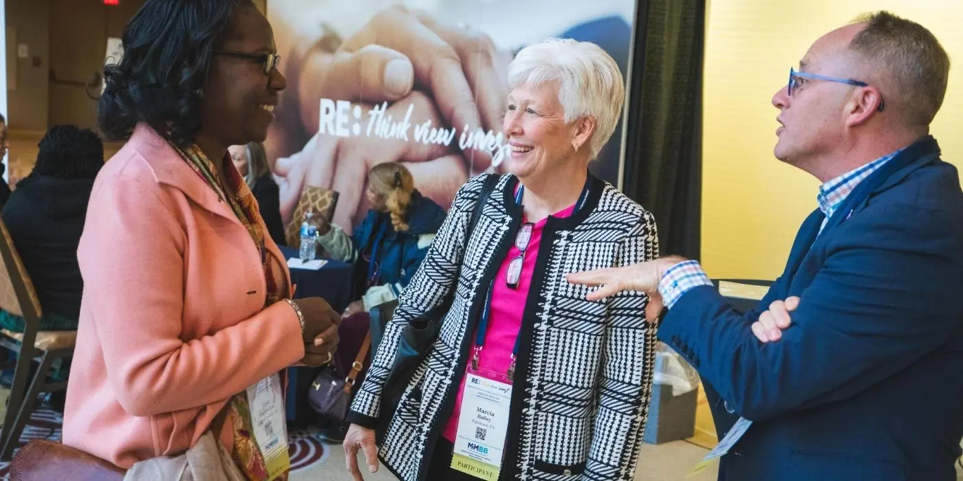
That’s also what gets attendees talking to each other. “You should run into somebody and they should say, ‘Have you seen the robot bartender? Have you seen the mini lounge? You should go check it out.’ And everybody’s like, ‘I didn’t even know where that was yet.’”
Bell says those moments do more than entertain. “It’s those surprises and delights that create a constant sense of discovery, which again allows people to connect back to why they’re there.”
In practice, that changes how you place things on the floor:
- Spread activations across the space instead of clustering them in one area.
- Tuck at least some of them out of the main sightline, around a corner or inside another space.
- Choose moments people will want to point a colleague toward.
What does owning the space architecturally look like in practice?
Owning the space architecturally means treating the venue as if it were built for your event by using custom wall clings, column wraps, environmental graphics, and ceiling-level branding to replace the generic hotel-ballroom reads attendees are already familiar with.
That’s a different way of thinking than bringing in a few elements that don’t work with the existing space. For example, pull-up banners at registration, a logo on the stage backdrop, maybe a step-and-repeat for photos. Using the architectural elements feels much more built and immersive than individual elements standing alone.
Bell adds a specific rule of thumb for how to prioritize these elements.
“There’s a rule I keep coming back to: shoulders and above,” he says. “Nine times out of ten it’s not worth investing below shoulder level in a crowded room, because everyone is looking up.”
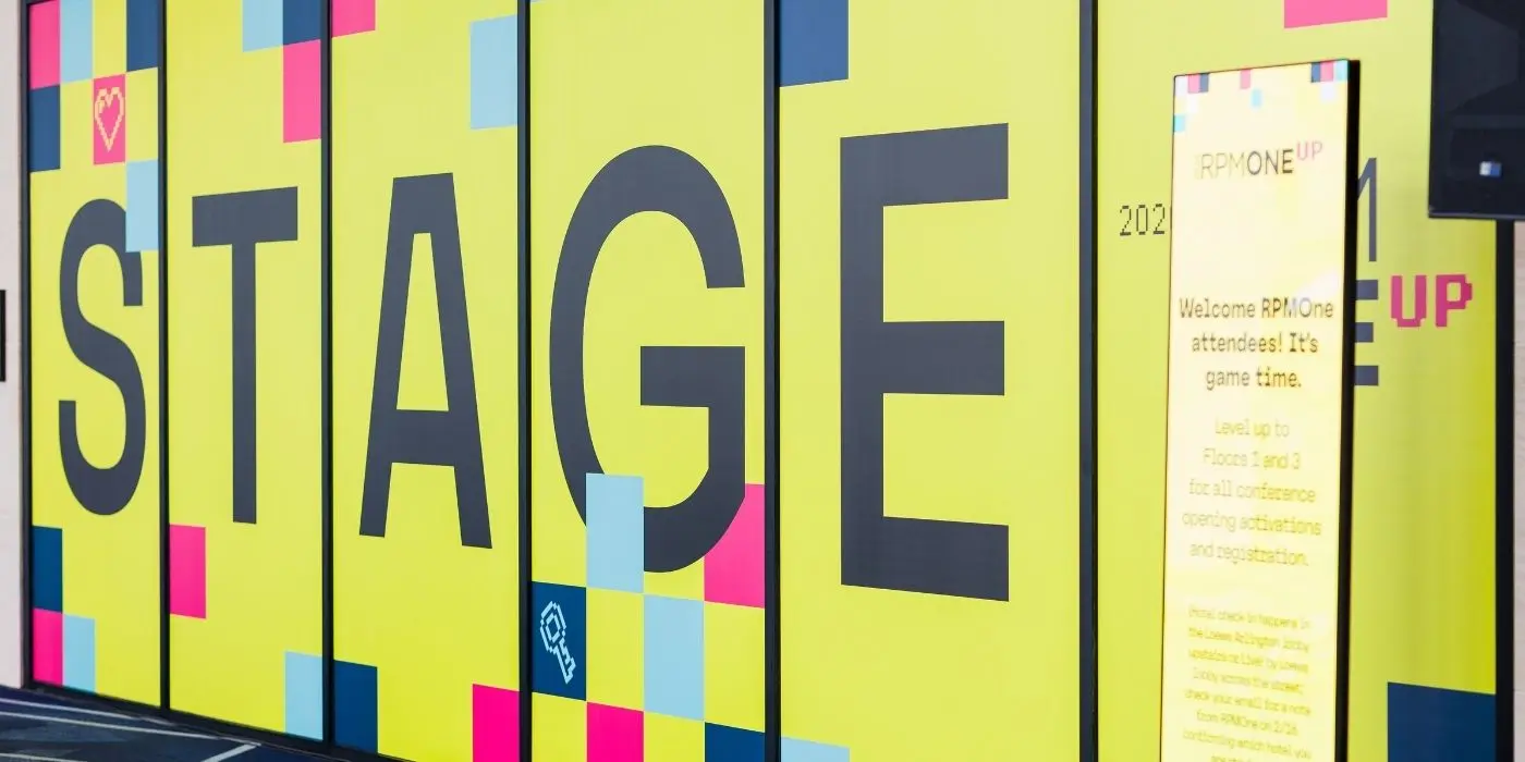
Where architectural investment tends to earn out, in order:
- Ceiling treatments, soffits, and overhead lighting with brand color integration.
- Column wraps and full-height wall clings in high-traffic sightlines.
- Elevated signage and scenic above the shoulder line in session rooms.
Skip floor-level treatments, which almost always disappear once the room fills up. However, high-impact graphics staircase risers can be the exception here.
Where should your budget go when you can’t transform everything?
When the budget can’t transform the whole venue, concentrate on three or four impact moments attendees physically pass through or stop to view.
Treat everything else as a neutral background, and let the entry sequence do most of the work. For example, a single compression-and-release entry into the general session, built with scenic framing you already own and a lighting cue the production team is running anyway, carries more brand impression than the same dollar spread across six pull-up banners in the pre-function space.
Bell’s framing for elevating the feel without raising the number is to drop the logo saturation and translate the brand into the physical environment instead.
“For an elevated feel without a bigger budget, I push quiet luxury over logos on everything, translate the brand’s color palette, textures, even its sound into the furniture and lighting,” he says. “Treat attendees like the informed professionals they are.”
If you are planning a recurring enterprise program where the room has to do strategic work, not just hold a stage, we would like to hear about it. Talk to Our Team to start the conversation.

Cindy Chea is the Content Specialist at Meeting Tomorrow. Whether it’s design, research, social media, or writing, she loves all things content and applying it to the world of events. A digital storyteller at heart, she thrives on transforming complex information into engaging, visual stories. At Meeting Tomorrow she helps ensure brand consistency across our platforms and develops creative content solutions for our team and the event professionals we support. When she’s not editing or looking for event inspo, you can find her journaling in a coffee shop or searching for the best bread basket in Philly.