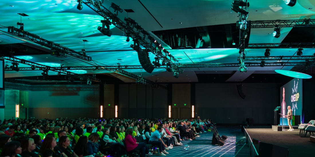


Somewhere in the last ten years, minimalism became the default instruction for corporate stage design. Clean lines. A neutral palette. One graphic element. A single podium. It reads sophisticated in renderings and moodboards. On stage? Well, when minimalism is misapplied, it can miss the mark.
If you own the annual conference, the sales kickoff, or the user summit — and you’re being told that stripping back the set is the mark of a mature brand — you need a clearer direction than “minimalism.”
Here’s the start of one: a general session isn’t a magazine cover. It’s a three-hour, stimulation-heavy environment. And the design principles that make a product photograph look expensive are not the principles that hold 1,200 people’s attention through a keynote, a product reveal, an in-depth panel, and four back-to-back speakers.
Where the Minimalist Instinct Came From: The Apple Keynote Effect
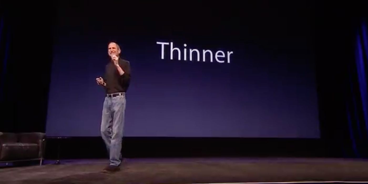
Minimalism didn’t arrive in event design by accident. Its modern reference point is the Apple keynote. When Steve Jobs walked onto a darkened stage — a black backdrop, a single enormous image, no bullet points, one presenter, one product — he rewrote what a corporate presentation could look like. The restraint was the whole point. Everything that didn’t serve the story was stripped away so nothing competed with the presenter and the object in his hand.
And it was genuinely great. The “Stevenote” became one of the most influential formats in corporate communication, and two decades later its DNA is still visible in nearly every keynote brief that asks for “clean and minimal.” The instinct behind it is sound: restraint keeps the focus on the person and the message, not the scenery.
So minimalism, done for the right reasons, isn’t the enemy. The problem is what happens when the aesthetic gets copied without the conditions that made it work.
Why It Worked for Apple
Apple’s minimalism succeeded under a very specific set of conditions. Apple controlled every variable in the room. And there was one magnetic presenter (with a flair for showmanship) the audience had shown up specifically to watch.
Most enterprise general sessions share almost none of that. They run for hours, not minutes. They feature multiple speakers of varying stage presence, panels, awards moments, and video rolls. There’s rarely a single object that can carry the entire visual load. Same aesthetic instruction, completely different job — and that’s where the copy-and-paste breaks down.
It also breaks down for a more basic reason: attention. Minimalism migrated into events from editorial and consumer branding, where a viewer engages with an image for only a few seconds and reduction works because the job is to make one thing legible fast. A general session is the opposite job. Your audience is committed to the room for hours; their attention isn’t scanning, it’s sustaining.
This is borne out in what attendees themselves say. Freeman’s 2024 Trends Report found that 64% of attendees rank immersive experiences as the most important element of their event experience (reported via PCMA). The useful reframe is that environmental design is an engagement lever, not just an aesthetic one — which matters for anyone who’s been optimizing a stage against a brief written for a different medium.
What Attendee Disengagement Actually Looks Like
When a marketing director tells us attendees “disengaged,” they usually mean one of three things: phones came out, side conversations started, or the energy in the room went flat between speakers.
While that’s partly a content problem, environmental cues — lighting levels, visual depth, spatial proportion, and texture — do real work on how long an audience stays cognitively present. A stage that reads as “unfinished” or “empty” telegraphs to the audience that what’s happening on it doesn’t require their full presence.
And this is the heart of what minimalism gets wrong in practice. Apple spent enormously on lighting, rehearsal, and the single perfect object at the center of the room. Strip that investment away and “minimal” stops reading as restraint and starts reading as unfinished or unintentional.
The Three Planes of a Working Stage
A general session stage works on three planes:
- Foreground — the presenter, any furniture, the podium or lounge configuration. This is what the audience looks at directly.
- Midground — scenic panels, brand treatments, columns, textured surfaces. This is what the audience registers peripherally, and what gives the foreground depth.
- Background — the LED wall, soft goods, architectural lighting, or projection surface. This defines the visual field and carries most of the brand and content weight.
Strip any one of these planes and the stage flattens. Common failure mode: a strong LED wall in the background, a presenter in the foreground, and nothing in the midground. The stage reads two-dimensional, and in photos the presenter looks pasted onto the screen. Another failure: a beautifully furnished foreground, a decent midground, and background lighting that hasn’t been designed with any intent. The stage reads literal — like a room, not a performance environment.
Lighting does more work than any scenic element. A restrained set with sophisticated lighting design almost always outperforms a heavily furnished set under flat wash lighting.
What Enterprise Event Teams Are Actually Asking For
The questions coming from enterprise planners in the last few months have narrowed to three:
- How do we scale stage presence for a hybrid audience watching on screen? The stage that reads well in-room can look surprisingly thin on a broadcast feed. A hybrid audience needs foreground contrast, midground depth cues, and camera-aware lighting angles that the in-room design brief usually doesn’t account for.
- How do we make the stage feel premium without a large scenic budget? This is almost always a lighting and texture question, not a scenic-build question. Layered lighting positions, gobos, and one strong textural midground element deliver more perceived value than three unlit scenic pieces.
- How do we carry brand identity through the full room, not just the stage face? Uplighting the room columns, treating the entrance, and running brand color through the ambient wash matter as much as what’s on the LED wall.
Notice what isn’t on that list: “how do we make the stage more minimal.” That instruction is coming from somewhere outside the operational reality of running a general session.
Design Moves That Hold Attention Without Adding Clutter
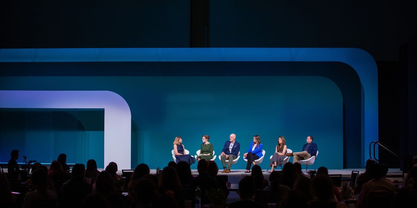
There’s a version of this conversation where “more design” gets misread as “more clutter.” It isn’t. The design moves that hold attention without adding visual noise are specific:
- Layered lighting positions. Front light, back light, side light, and a top wash — each doing a different job. The absence of any one is what makes a stage look flat.
- One textural midground element. A brushed metal panel, a tensioned fabric with a subtle brand pattern, an architectural column wrap.
- Purposeful color-temperature contrast between foreground and background. Warm on the presenter, cooler in the environment.
- A background that has depth, not just a graphic. Depth means the audience’s eye can travel into the environment rather than bouncing off a flat surface.
- Ambient room treatment that extends the stage design into the audience space. Uplighting, colored gobos on the ceiling, or treated entry columns.
The test isn’t “does this look minimal?” The test is “is every plane doing work?” For more info, we have a stage design guide that outlines different stage aesthetics that may be closer to what your brand is actually looking for.
How to Evaluate Your Current Stage Before the Next Event
Before you approve the next production brief, walk yourself through three questions:
- Cover the presenter with your thumb. Looking at last year’s general session photos, is there anything visually happening? If the answer is no, the stage was doing none of the environmental work.
- Watch where the eye goes with no speaker on stage. During a session transition or a video roll, where does the audience’s attention land? If the answer is “nowhere in particular,” the room has no visual anchor.
- Does the design extend into the room? If your stage feels like a picture hung on a wall rather than an environment the audience is inside of, you have a proportion problem.
Those three questions won’t produce a design. They’ll produce a much sharper conversation with whoever is producing your event.
So before your next general session, push back on the “clean and minimal” instruction if it’s arriving without a plan for what will do the environmental work in its place. Minimalism isn’t the target. Attention is. And attention responds to depth, layered lighting, and a room that has been designed as an environment, not a backdrop.
If you’re working through the design of an upcoming general session and want a second read on the stage brief, Talk to Our Team.

Kathleen Costanza is Meeting Tomorrow’s Content Manager, where she shapes and executes the Meeting Tomorrow’s content strategy to bring its brand to life. With more than 10 years of experience in B2B and nonprofit marketing, she creates thoughtful, high-quality assets across web, email, social, and sales channels, ensuring every piece reflects Meeting Tomorrow’s voice and makes life easier for busy event planners. Her work helps meeting professionals discover ideas, tips, and resources to make their events shine. Outside of work, she enjoys photography, quilting, and getting lost in a good documentary.